ArcGIS Story Maps has published a very valuable resource on redlining in American history. Redlining is perhaps the best illustration we have of systemic racism in America. Indeed, white people created public policy in American cities to keep Blacks segregated and we are still dealing with this racist legacy. This is not just a few “bad apples,” it is government-sponsored racism.
Here is a taste:
From the late eighteenth century detailed statistics on the number of enslaved peoples in the United States were produced by both the Federal Government and by some State institutions and as such, are critical to any study of the cartographic legacy of slavery in the United States. Many of these records were used to produce maps that are a lasting record of the spatial distribution of enslaved peoples in the US.
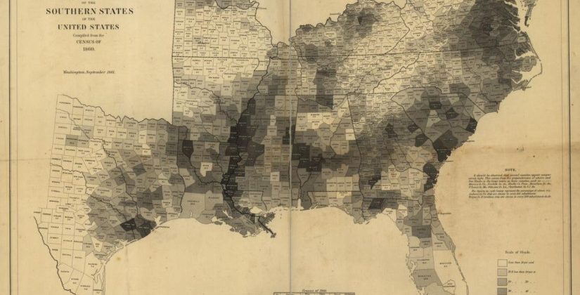
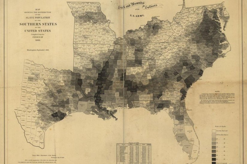
In September of 1861, nearly two years before the emancipation proclamation, the U.S. Coast Survey published a large map, approximately two feet by three feet, called a “ Map showing the distribution of the slave population of the southern states of the United States .” Based on population statistics gathered in the 1860 Census, the map depicted the percentage of the population enslaved in each county.
Although not the earliest compilation of such data, the map from 1861 showed, as few of the early statistical tables could, the extent and complex spatial patterns of the economic system that at the time kept nearly 4 million people in bondage. By 1860 slavery was concentrated along the Chesapeake Bay and in eastern Virginia, and along the South Carolina and Georgia coasts. Along with the fertile farm landscape in Georgia, Alabama and Mississippi, as can been readily seen on the map, its density deepened as one entered the Mississippi River Valley, with some counties, unbelievably, having more than 90 percent of their population enslaved.
With each county labeled with the percentage of the population enslaved it was, and still remains, one of the most poignant records of the extent of slavery in the United States during a critical period in its history, and was one of the first widely circulated government produced documents to visualize this kind of demographic data geographically.
Read the rest and see the maps and data here.